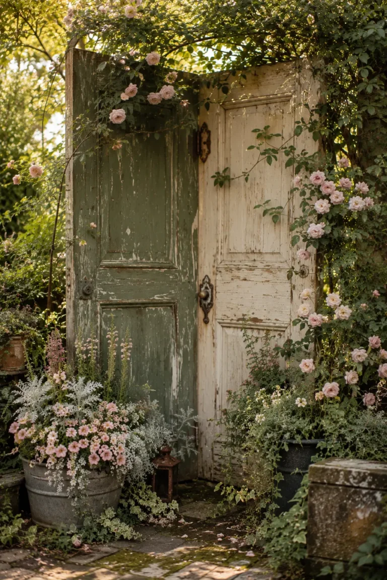
How to Choose a Planter Color That Makes Your Flowers Pop
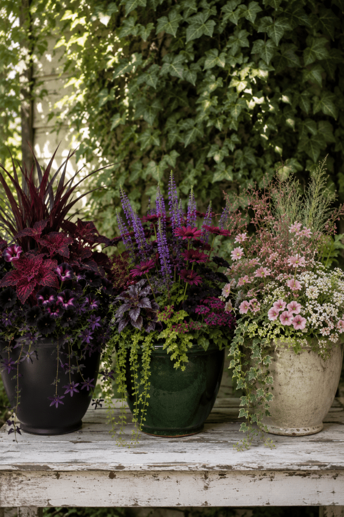
Nobody talks about planter color. Everyone should.
Walk through any garden center and you’ll see people agonizing over which flowers to buy — debating between petunias and calibrachoa, comparing leaf shapes, reading little plastic tags about sun requirements. Then they grab a basic terracotta pot, take everything home, plant it all up, and wonder why it looks a little… flat.
Here’s what they missed: the planter isn’t just a container. It’s part of the color story. And when you get it right, the whole thing transforms from “some flowers in a pot” into something that makes people stop, stare, and ask you what your secret is.
The good news? You don’t need a design degree or a botany background to figure this out. You just need to understand a few simple ideas about how colors work together — and then trust your eye.
The Planter Color Is the Foundation, Not an Afterthought
Think about it this way: if you were decorating a room, you wouldn’t pick out all your furniture and accessories first and then figure out the wall color last. The wall color sets the whole tone. It either elevates everything in the room or fights against it.
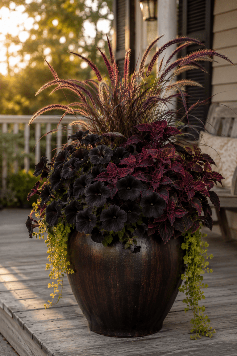
Your planter works the same way. It’s the largest single block of color in your container garden. It frames everything growing out of it. A dusty charcoal planter makes burgundy and purple flowers look rich and moody. That same planter with pale yellow flowers? Suddenly everything looks a little dull and heavy.
The planter color isn’t background noise. It’s the anchor that holds the whole look together.
The Two Approaches That Always Work
There are really only two strategies for planter color, and both of them work beautifully when you use them intentionally.
Approach 1: Match the mood
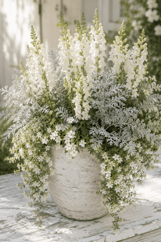
This is where you choose a planter color that lives in the same emotional world as your flowers. Deep, moody, dramatic flowers get a deep, moody planter. Soft, airy, romantic flowers get a soft, whitewashed, or pale planter. Everything stays in the same tonal family and the result feels cohesive and intentional — like it was styled rather than just planted.
A whitewashed planter with white snapdragons, cream bacopa, and silver dusty miller is a perfect example of this. Every element is soft. Every tone is gentle. Nothing fights for attention and the result is quietly breathtaking.
Approach 2: Create contrast
This is the bolder move, and when it works, it really works. You choose a planter color that sits on the opposite end of the color wheel from your flowers, creating a vibration that makes both colors look more alive.
The classic example: a cobalt blue planter with bright orange marigolds and yellow zinnias. Blue and orange are opposites. They shouldn’t work. They absolutely work — the blue makes the orange look more orange, and the orange makes the blue look more blue. It’s one of the greatest color combinations in container gardening and almost nobody does it intentionally.
Colors That Play Well Together
If you’re just getting started, here are some proven combinations to build confidence:
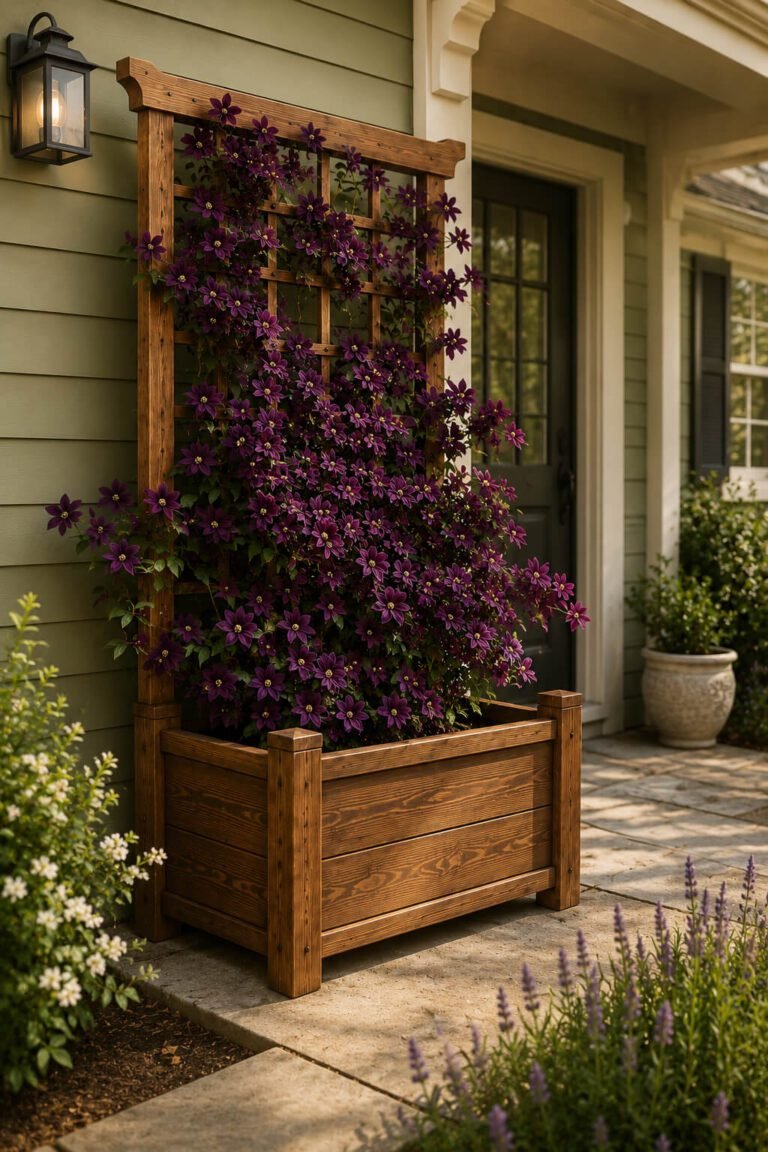
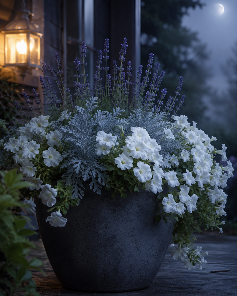
Charcoal or dark gray planters are the most versatile containers you can own. They make virtually every flower color look better — especially purples, burgundies, deep pinks, and whites. If you’re not sure what color to paint a planter, dark charcoal is almost never wrong.
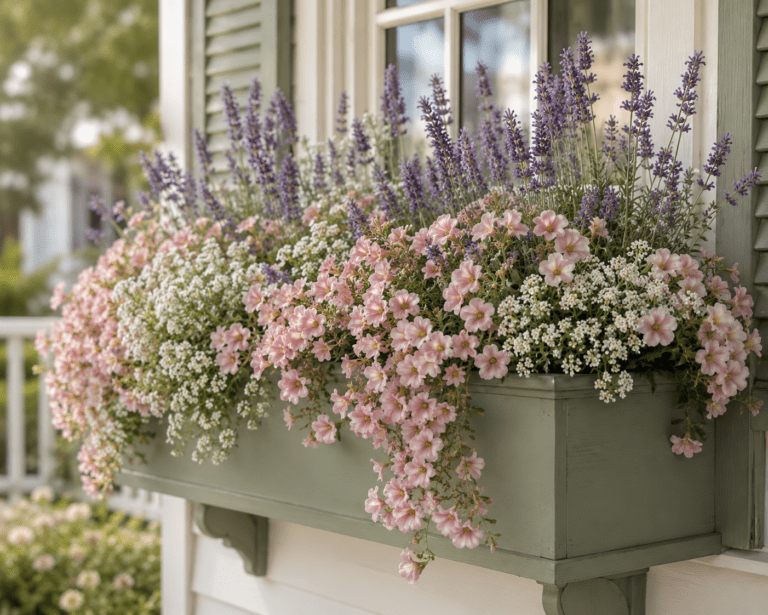
Sage green or soft olive planters are magic with blush pinks, creamy whites, and lavender. They have an earthy, organic quality that makes everything growing out of them look like it belongs in a French countryside garden.
Terracotta and warm rust tones are classics for a reason. They’re warm, grounded, and they make yellows, oranges, and deep reds glow. They also look beautiful with trailing green foliage.
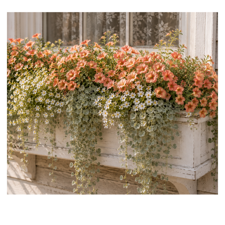
Whitewashed or pale cream planters brighten up shady spots and make light-colored flowers look ethereal. They work especially well with whites, pale pinks, and silvers.
Deep navy or midnight blue planters are underused and underrated. They create a sense of depth and drama that makes jewel-toned flowers — deep purples, ruby reds, emerald greens — look genuinely luxurious.
Antique cream or aged stone planters have a timeless, European quality that suits herbs and soft-colored flowers beautifully. Lavender, rosemary, white flowers — anything that wants to feel old and unhurried looks perfect in aged cream.
The One Mistake That Flattens Everything
The most common planter color mistake isn’t choosing the wrong color — it’s choosing a color that’s too similar in tone to the flowers without enough contrast to create any visual interest.
Think of a medium terracotta pot planted with medium pink geraniums. Both are warm, both are medium-toned, both are in the same general color family. The result is muddy. Neither the pot nor the flowers have anything to bounce off of.
The fix is simple: whenever your flowers are warm and medium-toned, reach for a cooler or darker planter. Whenever your flowers are pale and soft, choose a planter in the same quiet family or go crisp white. And whenever you want drama — go darker than you think you need to.
Paint Your Own Planters
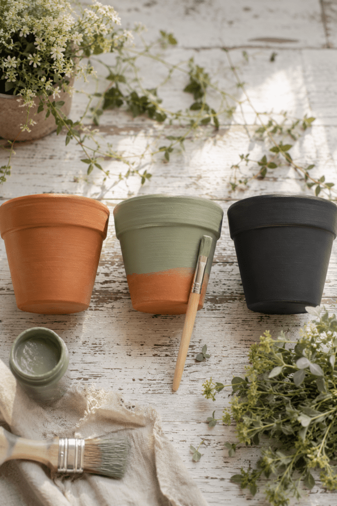
Here’s something that completely changes the game: you don’t have to accept the planter colors available at the garden center.
A can of spray paint and an afternoon is all it takes to turn a basic plastic pot into exactly the color you need. Chalk paint gives you that matte, soft finish that looks expensive and intentional. A simple mix of craft paint and water brushed over terracotta and then wiped back gives you a beautiful whitewashed effect in about twenty minutes.
When you realize the planter color is completely in your control, the whole creative process opens up. You’re not choosing flowers and then finding a pot that sort of works. You’re designing a complete color story from scratch — flowers, foliage, and planter all chosen to work together.
That’s when your porch stops looking like a collection of plants and starts looking like something people slow their car down to stare at.
Start With the Feeling You Want
Before you choose a single flower or pick up a paintbrush, ask yourself one question: what do I want people to feel when they look at this?
Calm and peaceful? Reach for soft blues, whites, and silvers in a cool gray or sage planter.
Warm and welcoming? Think peach, yellow, and soft orange in a cream or terracotta planter.
Dramatic and unforgettable? Go deep — dark flowers, dark planter, rich jewel tones.
Romantic and nostalgic? Soft pinks, lavender, and whites in a whitewashed or sage green planter.
The feeling comes first. The colors follow. And when everything is chosen to serve that one feeling, the result looks effortless — even though you made every single decision on purpose.
That’s not luck. That’s just knowing how color works.
Ready to skip straight to the finished look? Garden Color Recipes is a digital guide with 20+ complete planter combinations — flowers, foliage, and planter color all chosen together. No botany degree required. Just pick a vibe and plant the recipe.