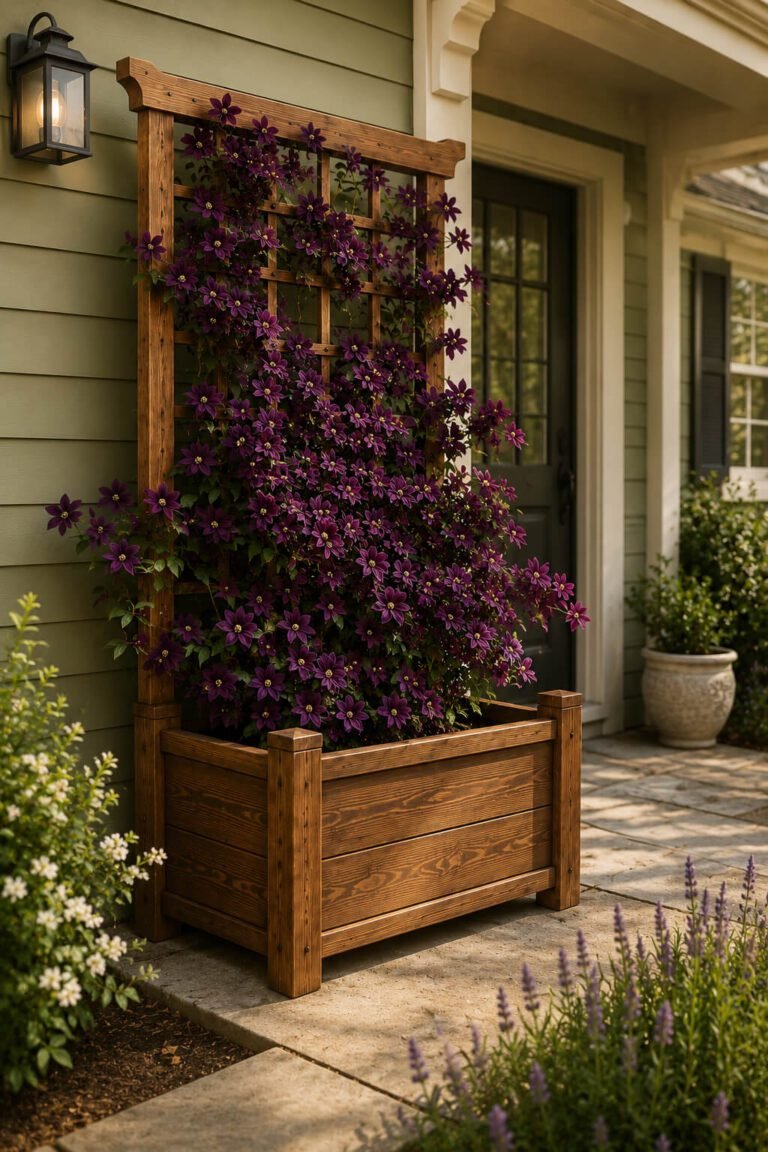
The Secret to a Beautiful Container Garden Has Nothing to Do with Gardening
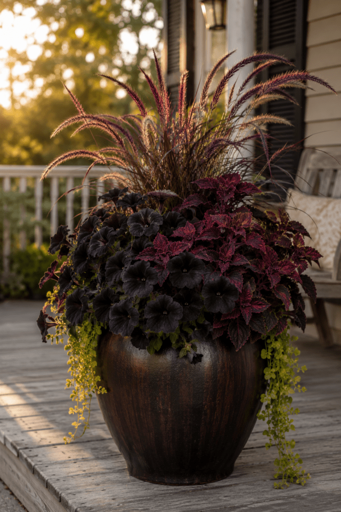
Every summer, millions of people buy beautiful flowers, take them home, plant them in pots, and end up with something that looks… fine. Not stunning. Not the kind of planter that makes the neighbors slow down. Just fine.
They followed the rules. They watered. They fertilized. They deadheaded. And still, something was missing.
Here’s what nobody tells you: the secret to a container garden that stops people in their tracks has almost nothing to do with gardening. It has everything to do with color.
Why Gardening Advice Only Gets You So Far
Most gardening content will tell you to think about sun exposure, soil drainage, and which plants have similar water needs. That’s all useful information. But it’s also why most container gardens look like a collection of healthy plants rather than something intentional and beautiful.
Healthy is not the same as stunning.
The people whose planters make you catch your breath aren’t necessarily better gardeners. They’re better at color. They understand — consciously or just instinctively — that a container garden is a design object first and a horticultural project second.
Once you see it that way, everything changes.
Color Is the Whole Game
Think about the last time a planter genuinely stopped you. Maybe it was on someone’s porch, or in a photo online, or in a magazine. You didn’t stop because the plants were thriving. You stopped because something about the combination of colors created a feeling — moody, romantic, cheerful, elegant — that hit you before you even had time to think about it.
That’s color doing its job.
Color communicates mood faster than any other design element. Before your brain registers “petunias” or “dusty miller” or “calibrachoa,” it has already registered dark and dramatic or soft and romantic or bright and joyful. The emotional response comes first. The rational identification comes second.
This is exactly why two planters with nearly identical plants can look completely different. One feels intentional and beautiful. The other just feels like plants in a pot. The difference almost always comes down to color relationships — between the flowers, between the foliage, and between all of it and the planter itself.
The Three Elements of a Complete Color Story
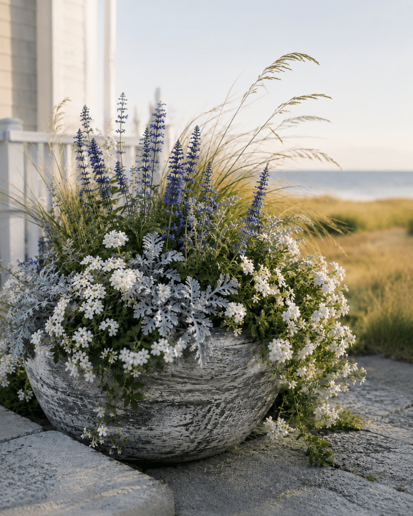
A container garden that truly works has three color elements working together, not just one or two.
The flowers are the obvious starting point, but they’re only one piece. Most people stop here. They pick flowers they love, put them in whatever pot is available, and wonder why the result doesn’t look like the photo that inspired them.
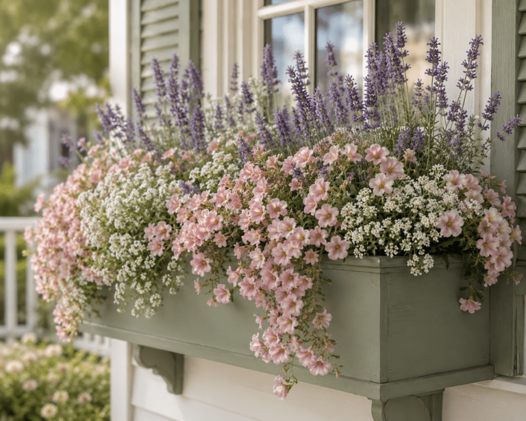
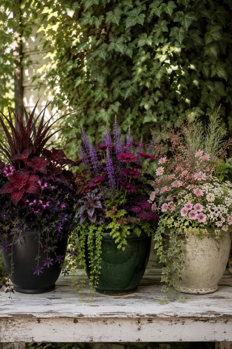
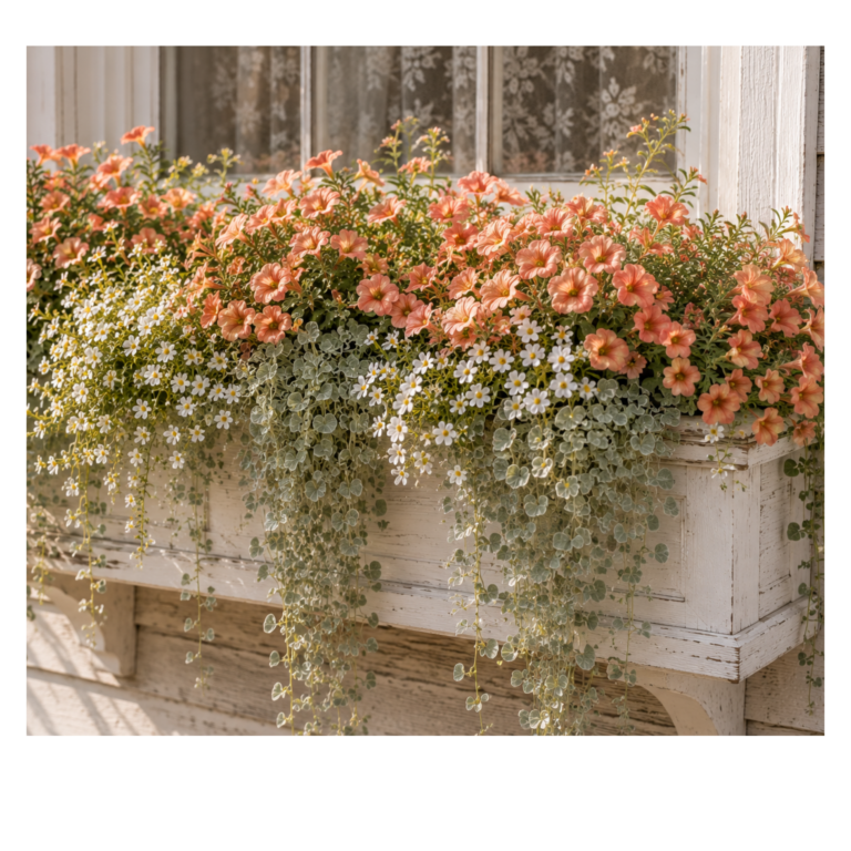
The foliage is the element most people underestimate. Foliage is the bridge — it connects the flower colors and fills the gaps between blooms. Deep green foliage grounds everything and makes flower colors pop. Silver foliage cools down warm tones and adds an airy, almost luminous quality. Burgundy or near-black foliage adds drama and depth that flowers alone can’t achieve. A planter without thoughtful foliage is like an outfit without accessories — it’s missing the thing that pulls it all together.
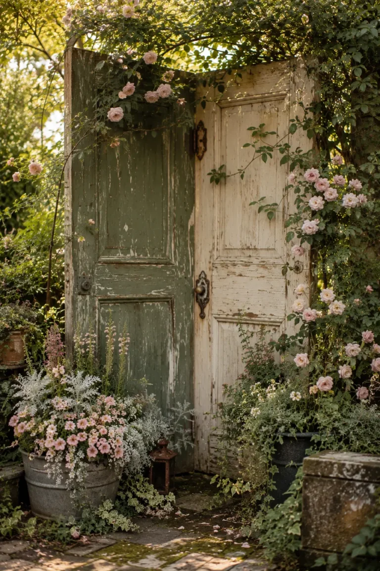
The planter itself is the foundation of the whole story. It’s the largest single block of color in the composition and it sets the emotional tone for everything growing out of it. A charcoal planter makes the same pink flowers look moody and sophisticated. A whitewashed planter makes them look soft and romantic. A cobalt blue planter makes orange flowers look electric. The planter isn’t neutral. It never was. Once you start treating it as an active color decision instead of an afterthought, your containers will never look the same again.
When all three elements are chosen to serve the same mood — same emotional world, same color temperature, same level of intensity — the result looks effortless. Designed. Like someone who really knows what they’re doing put it together on purpose.
Because they did.
Mood First, Plants Second
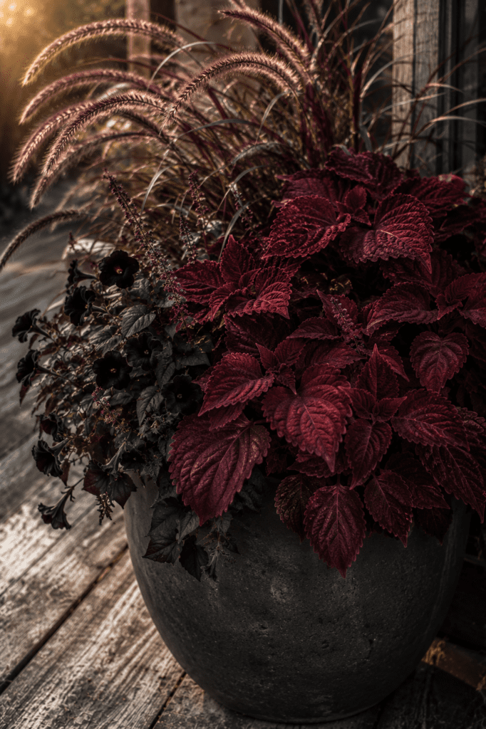
Here’s the practical shift that makes all of this click: start with the feeling you want, not the plants you like.
Most people walk into a garden center and browse until something catches their eye. They end up with flowers they love individually that don’t necessarily love each other. The colors fight, the tones clash, and the whole thing looks busy instead of beautiful.
Try this instead: before you look at a single plant, decide on a mood.
Do you want something that feels calm and serene? Start there and let that guide every choice — cooler tones, softer colors, a planter in gray or sage or soft blue.
Do you want something dramatic and unforgettable? Then you’re looking for deep, saturated colors — near-black flowers, rich burgundy foliage, a dark planter that makes everything feel like it’s lit from within.
Do you want warm and welcoming — the kind of planter that makes your front porch feel like a hug? Then you want peach, cream, soft yellow, terracotta tones throughout.
When the mood is decided first, every choice after that becomes easier. You’re not asking “do I like this plant?” You’re asking “does this plant belong in the story I’m telling?” That’s a much easier question to answer.
You Already Know More Than You Think
Here’s the thing about color instinct: most people have more of it than they realize. You probably already know which outfits make you feel like yourself and which ones feel off. You probably already have opinions about which rooms feel good to be in and which ones feel strangely uncomfortable even when you can’t explain why.
That’s color sensitivity. You have it. You’ve just never applied it to your garden.
The person whose planter you can’t stop thinking about isn’t working with secret knowledge. They’re applying the same instinct you use when you get dressed in the morning — matching tones, balancing warm and cool, making sure nothing fights for attention in a way that feels wrong.
The only difference is they’re doing it with petunias instead of a wardrobe.
The Shortcut That Actually Works
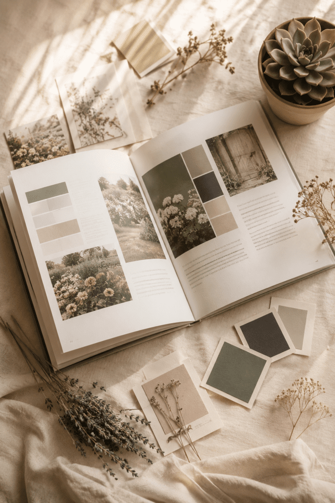
Understanding color theory is useful. But the fastest way to get beautiful results is to work from complete, tested combinations — where someone has already figured out which flowers, which foliage, and which planter color create a specific mood together.
Think of it like a recipe. You don’t need to understand the chemistry of why certain flavors work together to follow a recipe and end up with something delicious. You just need the recipe.
That’s exactly what a well-designed container garden combination gives you. Here’s the mood. Here’s what to plant. Here’s what color to paint the pot. Now go make it.
No trial and error. No spending money on combinations that don’t work. No wondering why your planter looks fine when you wanted it to look stunning.
Just a complete color story, handed to you, ready to plant.
Start Seeing Gardens Differently
Once you understand that container gardening is really a color and design exercise wearing garden gloves, you start seeing everything differently.
You notice why the planter on the corner house stops you every single time you drive past. You understand what’s missing from your own porch. You walk into a garden center and instead of browsing aimlessly, you arrive with a mood in mind and you know exactly what you’re looking for.
You stop making fine planters. You start making ones that people slow their car down to look at.
It was never about the gardening. It was always about the color.
Want the combinations already figured out for you? Garden Color Recipes is a digital guide with 20+ complete planter combinations — flowers, foliage, and planter color all chosen together to create a specific mood. No botany degree required. Just pick a vibe and plant the recipe.